BrandingGraphic Design
Dilys Group — Rebrand
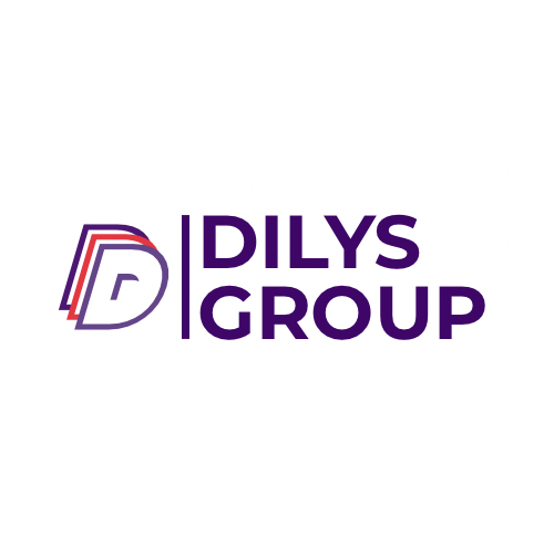
A layered monogram and sub-brand system for Dilys Group, a Canada-based group of companies.
- Year
- 2024
- Role
- Brand Identity · Logo Design · Sub-brand System
- Discipline
- Branding
- Client location
- 🇨🇦 Canada
Design process
01
Monogram
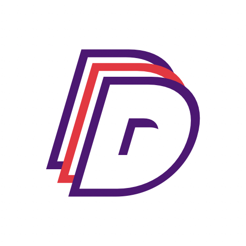
Build the D from three offset strokes so the mark reads as layered growth.
02
Colourways
Anchor the group in deep violet, with red and amber accents to separate sub-brands.
03
Sub-brands
Extend the lockup into Dilys Search with a matching divider rule and weight.
04
Reproduction
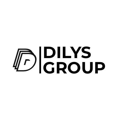
Ship mono, colour and icon-only variants for print, screen and avatars.
Selected artwork


Tools used
- Illustrator
- Typography
- Colour
- Brand Systems